Introduction
Affinity diagrams are a tool to organize many ideas into their natural relationships, grouping them according to their affinity with each other [1], and allowing for data and information to be represented hierarchically [2]. They are built bottom-up to ensure groupings and headings are made based on the data alone and remain uninfluenced by outside bias. The affinity diagram is one of the Seven Management and Planning Tools developed by the Union of Japanese Scientists and Engineers (JUSE) that promotes innovation, communication information, and successfully plans major projects [3]. Today, these diagrams are largely used in contextual design practices and are tailored to better suit small to medium interaction design projects in industrial and academic contexts [2].
History of the Affinity Diagram
Affinity diagraming is also known as the “KJ Method” after its creator, Jiro Kawakita, who is a Japanese ethnologist [4]. During the 1950s and 60s, Kawakita developed the KJ Method as a consequence of developing analytical techniques the ethnographic data he retrieved in his research of Himalayan social organization and rituals [4]. It took around 15 years for Kawakita to systematize the method, and then proceeded to teach it at various leading universities and colleges in Japan, and it eventually diffused into every sector of Japanese business, research, and education [4]. The KJ Method was developed for a new idea generation and is able to establish an orderly system from chaos [5], and it is widely used in various research and industry fields today.
How Do You Make an Affinity Diagram?
The KJ Method has four steps: label making, label grouping, chart-making, and written or verbal explanation, which is also known as “walking the diagram” [4]. Although the KJ Method does create a basic affinity diagram in its process, the current day practice of building an affinity diagram does not directly follow this process exactly. Instead, two contextual design experts, Hugh Beyer and Karen Holtzblatt, have created a separate affinity diagraming process modeled off the KJ Method, and can be consolidated into 5 steps [6]:
- Generate and brainstorm ideas and write each one on a post-it note.
- Display the ideas on a wall or table in a random manner.
- Sort the ideas into related groups. Start by looking for two ideas that are related in some way and begin a column with those two ideas. Then look for ideas that are related to those two and add them to the column. This process can be used to create more groups.
- Create header cards for all the groups and place them at the top of each group column. Header cards have an idea that captures the link amongst all the ideas in the group, which could be an existing card in the group or a completely new card. Relationships identified between groups can be shown with a superheader card, which the same as a header card but for multiple groups instead of just one, and the columns should be rearranged so they’re next to each other under the superheader card. There can be multiple levels of superheader cards if superheader groups are related and can be grouped together.
- Properly organize all the groups and ideas into an affinity diagram. Write a problem statement at the top of the diagram, then place header and superheader cards above the groups of idea.
Example Affinity Diagram
In product development, it is important to gauge customer insight, typically through focus groups or one-on-one interviews [7]. In a customer needs analysis study, participants worked together to create an affinity diagram, which was to determine how successful affinity diagrams are in identifying representative consumer needs of particle accelerators [7]. In the study, the group of participants was handed cards with customer needs information one at a time in a randomized order. They were instructed to group the cards, modify the groupings when necessary, and name each cluster based on the groupings constructed. Figure 1 displays the resulting affinity diagram created by the participants. The headers determined by the participants were “future potential,” high performance,” “low cost,” and “high availability,” with some cards only placed under one header and some placed under multiple. The affinity diagramming methodology in this study follows Beyer and Holtzblatt’s process and did result in a traditional affinity diagram. However, this study was unique in asking the consumers to create an affinity diagram instead of the researchers themselves creating one based on previous research or their own knowledge of the product. As illustrated by Figure 1, recruiting consumers to complete their own affinity diagrams gives product developers insight into the larger representative needs of their consumer base, which can hopefully guide and improve the future development of their products.
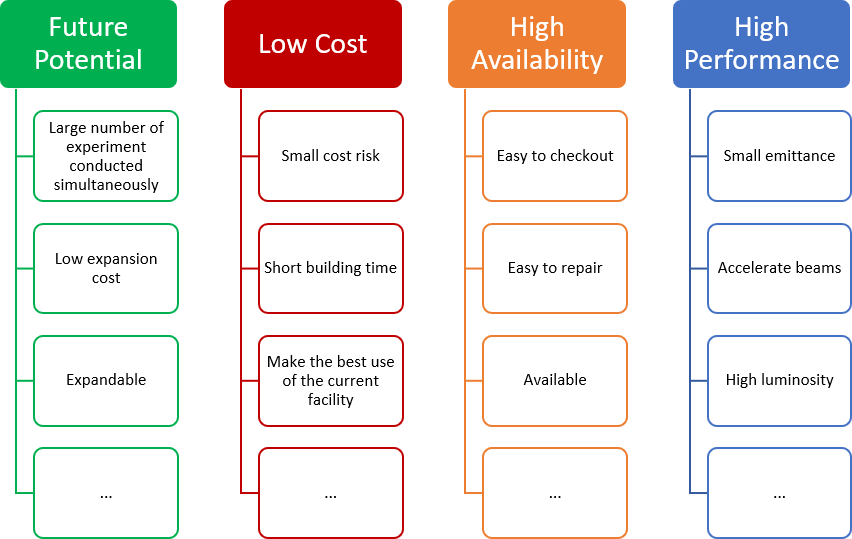
Figure 1. Example affinity diagram of representative needs for particle accelerators based on Takai and Ishii [7]
Conclusion
Affinity diagramming has greatly evolved since the formulation of the KJ Method and has even evolved since Beyer and Holtzblatt perfected it for contextual design purposes. Because the process of affinity diagramming is so intuitive, sometimes the core concepts of this process are used without knowledge of what an affinity diagram is. Many may use the concepts behind affinity diagramming, such as sorting and clustering, thinking that it is just “common sense” [8]. Knowing and understanding the history of affinity diagramming is not usually prioritized because conceptual knowledge of diagramming methods and when to use them are what is most valued [8].
At the end of the day, designers want to use methods that are easy to explain and visualize to aid with explanations of their ideas [8]. However, understanding the history and the evolution of affinity diagramming gives context to why this diagramming method has been popularized in many industries today, and the ability of this model to be utilized for only its core functionalities speaks to how easy it is to use and get productive results. Examining the degradation process of formalized methods, such as affinity diagramming, to its “core ideas” is important for providing insight into how these methods are modified, how they enter design vocabulary over time, and how they eventually die out [8].
Works Cited
[1] “What is an Affinity Diagram?,” ASQ. https://asq.org/quality-resources/affinity
[2] A. Lucero, “Using Affinity Diagrams to Evaluate Interactive Prototypes,” in Human-Computer Interaction – INTERACT 2015, vol. 9297, J. Abascal, S. Barbosa, M. Fetter, T. Gross, P. Palanque, and M. Winckler, Eds. Cham: Springer International Publishing, 2015, pp. 231–248. doi: 10.1007/978-3-319-22668-2_19.
[3] “What are the Seven New Management & Planning Tools?,” ASQ. https://asq.org/quality-resources/new-management-planning-tools
[4] R. Scupin, “The KJ Method: A Technique for Analyzing Data Derived from Japanese Ethnology,” Hum. Organ., vol. 56, no. 2, pp. 233–237, Jun. 1997, doi: 10.17730/humo.56.2.x335923511444655.
[5] H. Ohiwa, N. Takeda, K. Kawai, and A. Shiomi, “KJ editor: a card-handling tool for creative work support,” Knowl.-Based Syst., vol. 10, no. 1, pp. 43–50, Jun. 1997, doi: 10.1016/S0950-7051(97)00015-4.
[6] “Basic Tools for Process Improvement: Affinity Diagram.” Balanced Scorecard Institute. [Online]. Available: https://balancedscorecard.org/wp-content/uploads/pdfs/affinity.pdf
[7] S. Takai and K. Ishii, “A Use of Subjective Clustering to Support Affinity Diagram Results in Customer Needs Analysis,” Concurr. Eng., vol. 18, no. 2, pp. 101–109, Jun. 2010, doi: 10.1177/1063293X10372792.
[8] C. M. Gray, E. Stolterman, and M. A. Siegel, “Reprioritizing the relationship between HCI research and practice: bubble-up and trickle-down effects,” in Proceedings of the 2014 conference on Designing interactive systems, Vancouver BC Canada, Jun. 2014, pp. 725–734. doi: 10.1145/2598510.2598595.
[9] Featured image provided by Niya Watkins https://www.niyawatkins.com/mirror