
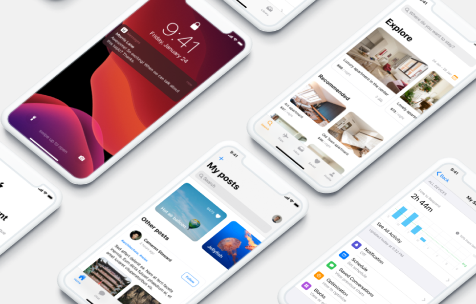
Figma is a web-based tool that streamlines the product design process from start to finish [2]. To make design accessible to everyone, it has a number of unique features for designing, prototyping, and collaborating [2]. After testing out Figma with my own work, I’ve compiled a list of features that I found particularly useful in facilitating my design workflow. This post serves as an introduction to these features to help you make the most out of all the resources Figma has to offer.
Design
Figma has several functionalities that aim to make design easier without compromising its capabilities [3]. In the following section, I discuss a few of these features.
Auto Layout
Auto layout can be added to frames and components to create dynamic elements that resize and reflow along with their contents [4]. This can be useful in many cases where you need to create responsive designs, such as navigation bars, card items, buttons, and list views. Additionally, you can ensure that the elements you create can work across various device sizes.
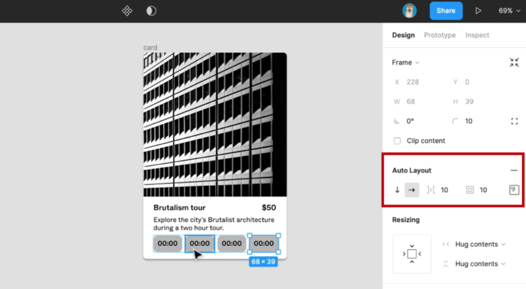
Source: Image from [4]
To use auto layout, you can either click the ‘+’ sign next to Auto Layout in the right sidebar or use the keyboard shortcut ‘shift’ + ‘A’. After adding this, you will see some options pop up under Auto Layout (see Figure 1). Clicking the arrows will specify the direction that the element will resize along; the down arrow will resize along the y-axis, which is useful for things like lists or social media feeds, and the right arrow will resize along the x-axis, which is useful for things like rows of buttons and or icons [4]. The button directly next to the arrows is used to specify spacing between items in the Auto Layout frame, and the rightmost two buttons allow you to specify padding sizes. You can either enter a numerical value to set equal padding on all four sides of the element or click open the last button to manually set unique values for each side.
Components
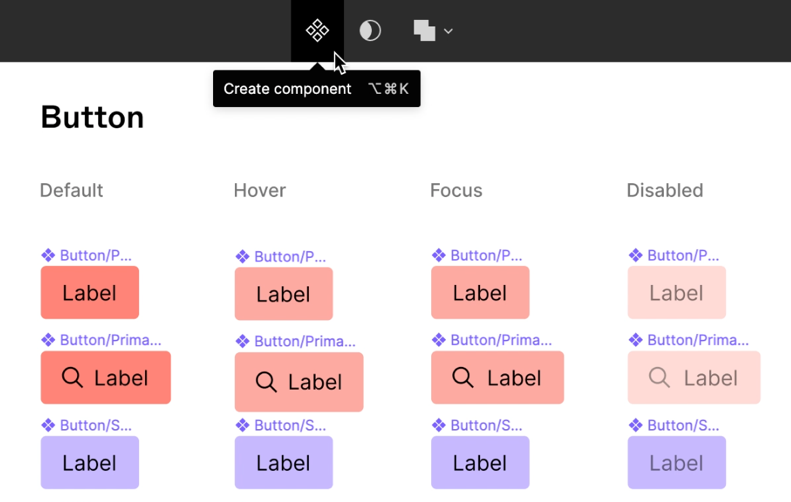
Inspired by the popular use of components in engineering contexts like app, web, and game development, Figma created Components to allow designers to reuse existing designs instead of spending extra time on repetitive and tedious work [5]. Components are composed of two parts: a Main Component and its Instances [6]. After creating a Main Component with specified properties such as color and size, you can create as many Instances of it as needed. These Instances are essentially just copies and are all linked to the Main Component, meaning any changes made to the Main Component will be automatically applied to all the Instances as well. This helps tackle design in a more efficient and intuitive manner, as well as simplify the handoff process to developers.
Source: Image from [6]
To create a Main Component, select all the necessary layers and then select the ‘Component’ icon in the main toolbar (see Figure 2). These layers will then be nested together in a component frame, which you can see and rearrange in the Layers panel of the left sidebar. Lastly, you can add a Description and Documentation Link in the Inspect panel to help collaborators and viewers better understand the component [6].
To create instances of a component, hold the ‘alt’ key and drag from the component, or simply copy and paste. Observe that if you change anything in the Main Component, all its Instances will reflect the same change. However, if you change something in an Instance, only that Instance will change. In this case, you are overriding the original components properties, and saying that you want this particular instance to have a different style [5]. A potential use case for this is if you have a filled button component, but want to have an unfilled button on one particular screen.
Prototyping
Prototyping in Figma turns your designs into interactive experiences by connecting frames with smooth transitions and adding subtle interactions to mouse actions [7]. This will help you create realistic experiences that mimic what the actual product will be like. Below are some unique features that you can prototype in Figma.
Smart Animate
Smart Animate helps you easily create highly requested customer features that users have pre-existing expectations for [8]. This might include a swipe to remove transition, which is common in email and messaging apps, or a pull to refresh animation, which is common in social media apps.
Source: Image from [8]
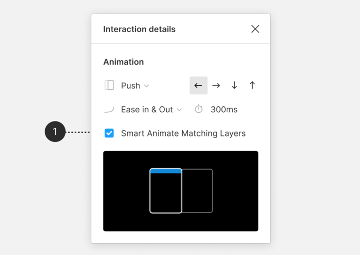
To use Smart Animate, navigate to the Prototype tab in the left sidebar, and create a connection by dragging a node from one frame to another. An ‘Interaction Details’ window will pop up, in which you can select Smart Animation, and specify other properties such as Easing, Duration, and Trigger [8]. Smart Animate will then identify property differences between the two frames and animate them accordingly. For example, if you scale an element to be bigger on one screen and smaller on the other, Smart Animate will animate it to shrink or grow.
Smart Animate depends on how your layers are named and where they sit in the order hierarchy, so it is important to organize and name layers carefully [8]. For example, if you select the checkbox “Smart Animate Matching Layers,” Figma will only Smart Animate the layers that don’t have the same name and not the layers that do have the same name (see Figure 3). A particularly good use case of this is for switching between tabs on a mobile app. Typically this action happens with the tab icons fixed in place, while the rest of the screen transitions. With Smart Animate, this advanced transition is possible to replicate.
Overlays
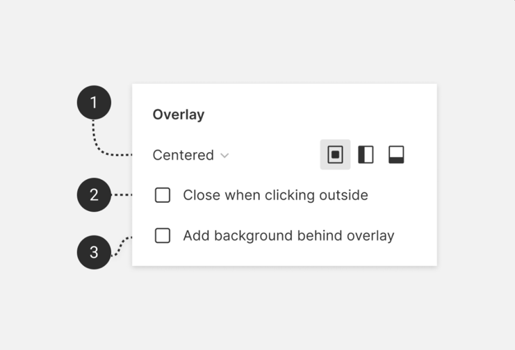
Source: Image from [9]
Overlaying is a common animation we see in elements such as alerts, hamburger menus, and on-screen devices on mobile apps. Typically, overlays are triggered by an action such as clicking on a button and therefore can be easily prototyped by dragging the node from the object you want to overlay from to the frame that will act as the overlay [9]. After specifying the action type “Open Overlay,” Figma gives three more properties to customize (see Figure 4). First, you can determine the position of the overlay relative to the original frame. While you can manually set a position, there are also 7 default positions for things like keyboard overlays, which always appear at the bottom of a mobile frame. Next, you are given the option to check “Close when clicking outside” to easily prototype the transition back to the original frame. Lastly, you can add a background color behind the overlay and in front of the original frame. This allows you to mimic animations such as dimming the rest of the screen when opening a menu bar.
Collaboration
Because Figma is built in the cloud, collaborators do not need to sync to get the newest updates – everything happens in real-time [10]. Designers can even see each others’ cursor actions on the file so that there is no worry of running over each others’ work [10]. Here are some ways Figma brings together different parts of the team – from designers to product managers and engineers.
Simple Sharing and Feedback
Sharing prototypes is essential to gathering feedback on designs. Figma’s sharing process is incredibly simple and works quite similarly to Google Drive’s sharing capabilities. After clicking the blue “Share” button in the corner, you can send invites to emails and control viewing, editing, and commenting permissions for each person you add. You can also create a sharable link for anyone to work on the Figma file in a web browser or a link to a prototype ready for presentation [10].
Users can add comments and reply to feedback directly on the Figma file. After clicking the Comment icon in the main toolbar, you can view comments in two different places depending on your needs. First, you can see them directly on the canvas wherever the author left them. This is useful if you like to work with visual representations of data since this groups together comments with their corresponding designs. Secondly, you can view the whole list of comments in the right sidebar if you prefer to work more methodologically. In this panel, you can sort comments by date or page. You can also filter for comments that are only relevant to you. This includes comments you created, were tagged in, or replied to [11].
Accessible Design System
For teams that design multiple projects for an organization or company, maintaining a design system with reusable assets is especially important to design consistently and efficiently. Figma provides various tools that allow you to create and reuse designs within and between projects.
When you create a component, it is automatically added to the Assets tab in the left sidebar. These components are accessible from any project and are searchable by either their description or name [12]. A small visual preview is also shown, which you can directly drag and drop onto the canvas. This makes it easy to reuse components that are common across your projects, such as custom icons or logos. Additionally, there is a myriad of downloadable resources across the community that can speed up workflow, such as UI kits and font libraries [12]. After importing, these are also accessible from the Assets tab.
Figma also provides tools to simplify the handoff from designers to developers. If you view the Inspect tab in the right sidebar, you will see a list of global styles used in the project, including text and color styles. Currently, this information is only available in CSS, iOS, and Android. To see more detailed code about properties like position and background color, simply inspect the desired element. Lastly, you can export assets like images and icons to use in development. To do this, select the desired element, navigate to the Design tab in the right sidebar, and click “Export.” You can select the file size and type that is fit for your needs.
Main Takeaways
Figma offers users all the tools needed for them to design and prototype seamlessly. From simple components to complex animations, users are able to design without silos and have the resources to create exactly what they have in mind. As a user, I found the interface easy to learn and the real-time collaboration unparalleled. Additionally, the experience was incredibly intuitive and convenient because all design, prototyping, and sharing stages live in a singular tool. Since this post only covers a few of my personal favorite features, I encourage you to explore Figma on your own, as it offers many more exciting resources that may be useful to you.
Works Cited
[1] “Figma,” Figma. https://www.figma.com/community/explore (accessed Jun. 04, 2021).
[2] “Figma: the collaborative interface design tool.,” Figma. https://www.figma.com/ (accessed Jun. 03, 2021).
[3] “Design, prototype, and gather feedback all in one place with Figma,” Figma. https://www.figma.com/design/ (accessed Jun. 04, 2021).
[4] “Create dynamic designs with auto layout,” Figma. https://help.figma.com/hc/en-us/articles/360040451373-Create-dynamic-designs-with-auto-layout (accessed Jun. 03, 2021).
[5] “Components in Figma,” Figma. https://www.figma.com/blog/components-in-figma/ (accessed Jun. 03, 2021).
[6] “Create components to reuse in designs,” Figma. https://help.figma.com/hc/en-us/articles/360038663154-Create-components-to-reuse-in-designs (accessed Jun. 03, 2021).
[7] “Free Prototyping Tool to Create Clickable Prototypes,” Figma. https://www.figma.com/prototyping/ (accessed Jun. 03, 2021).
[8] “Create advanced animations with Smart Animate,” Figma. https://help.figma.com/hc/en-us/articles/360039818874-Create-advanced-animations-with-Smart-Animate (accessed Jun. 03, 2021).
[9] “Create overlays in your prototypes,” Figma. https://help.figma.com/hc/en-us/articles/360039818254-Create-overlays-in-your-prototypes (accessed Jun. 03, 2021).
[10] “Figma | The all-in-one design tool built for collaboration,” Figma. https://www.figma.com/collaboration/ (accessed Jun. 03, 2021).
[11] “View and manage comments,” Figma. https://help.figma.com/hc/en-us/articles/360041547593-View-and-manage-comments (accessed Jun. 04, 2021).
[12] “Design, manage, and deploy your design systems with Figma,” Figma. https://www.figma.com/design-systems/ (accessed Jun. 04, 2021).
