
What is CustomTkinter?
CustomTkinter is a powerful, modern, and customizable python UI-library based on
Tkinter, a standard graphical user interface (GUI). It was developed and released this year by Tom Schimansky and a small group of other talented developers (you can see a full list of the contributors on their CustomTkinter GitHub). Given CustomTkinters recent release, the availability of resources and tutorials is very limited aside from the documentation provided on their official website. This blog will provide an in depth overview of how to use CustomTkinter while providing example code that you can use to follow along. Let’s get started!
Installation
Python will be needed in order to use CustomTkinter, so if not already installed, head to Python’s website to download. Once you have done so, you will want to be sure you also have CustomTkinter installed on your device. To do so, open your terminal (if you’re on Mac) or Command Prompt (if you’re on Windows) and run the following line:
pip3 install customtkinterOnce you have copied, pasted, and ran the line above, you are all set to begin!
Getting Started
CustomTkinter can be structurally styled in two ways: simple or object oriented. For all intents and purposes, and because I’m sure you’re not here just to build simple applications, we will be structuring our code in an object oriented manner. I advise that you follow along and visit the provided GitHub repository to view all code that I exemplify with images and starter code. Now that we got that down, let’s get to work!
CustomTkinter allows for built in Light, Dark, and System mode appearances with the choice between blue, dark blue, and green color themes. However, if you believe your creative juices can come up with something more exciting than the standard blue and green themes, you can easily craft a JavaScript Object Notation (JSON) file to specify custom colors using hexadecimal codes for the available tools – but let’s stick to a built-in theme for now. To begin, let’s start by defining our application class. Here is some starter code:
import customtkinter

# Modes: "System" (standard), "Dark", "Light"
customtkinter.set_appearance_mode("System")

# Themes: "blue" (standard), "green", "dark-blue"
customtkinter.set_default_color_theme("blue")

class App(customtkinter.CTk):
    def __init__(self):
        super().__init__()

        # Window/App Customization
        self.geometry("500x250")
        self.title("Starter Code Example")

        # Grid Configuration
        self.grid_columnconfigure(0, weight=1)
        self.grid_rowconfigure(0, weight=1)
        self.grid_rowconfigure(1, weight=1)

        # Widgets
        label = customtkinter.CTkLabel(self,
                                       text="Hello Blog World!",
                                       font=("Arial", 25),
                                       anchor="center")
        button = customtkinter.CTkButton(self, text="Click Me!")

        # Placing Widgets on Grid
        label.grid(row=0, column=0)
        button.grid(row=1, column=0)

app = App()
app.mainloop()
The code can be found in the provided GitHub repository, named starter.py
When running this code, a window pops up that is titled “Starter Code Example” with text that says “Hello Blog World!” and a button that says “Click Me!”. Both the text and button are centered in the middle of the window:
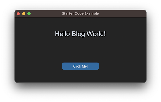
Figure 1: A window of the application from the starter code.
At the moment, clicking the button will not do anything, but we’ll go over how to change that when we are creating our complex application later on in this blog. So, what exactly is going on here? Well let’s break it down into the following: the class, the window customizations, the widgets, and the grid.
Creating Classes
A class is a template for how to create an object. The general format is as follows:
class ClassName(customtkinter.CTkWidget):
    def __init__(self):
        super().__init__()
        # Your code goes here
Your ‘ClassName’ defines the name of your class, inheriting functionality from a custom widget class that will serve as the parent, as indicated by the placeholder ‘customtkinter.CTkWidget’. The ‘__init__’ method serves as your class constructor. When ‘super().__init__()’ is called, it initializes and runs the parent class’s constructor before executing any custom code.
In our example starter code, we designated our ‘ClassName’ as ‘App’, used ‘customtkinter.CTk’ as the parent class, and ensured that when an instance of ‘App’ is created, it initializes and executes the parent class’s code along with any additional code we’ve written. Simple enough, right? So, then what about the window we see after running the code? Well, let’s talk about it!
Window Customizations
There are a couple of built in window/app customizations. These include defining the title of the window, the size of the window, the appearance mode, and the color theme. Each of these customizations are one line long and fairly easy to understand.
Titling Your Window
At the top of every window application, you will see a bar where your title for the application can go. This is across the same bar that closing out the window is located. If you so choose to title your window, you can copy and paste the code below into your app’s main class.
self.title("Title Goes Here")In this line of code, ‘self’ refers to the class instance, and ‘title’ is a function used to set the title of the window. You provide a string as an argument to the title function, and that string becomes the title displayed in the window’s title bar (tada!).
Adjusting Window Size
Specifying your application’s window size is no harder. This time, the function you will use is ‘geometry.’ The function will take in a string that follows the format “LengthxWidth”. Keep in mind that both length and width are in terms of pixels. So, if I wanted to make my window have a length of 500 pixels and width of 250 pixels (as in the starter code), then I would do the following:
self.geometry("500x250")Try adjusting the values in your code to see various window sizes!
Configuring Appearance Mode
The appearance of your window has three built in modes: Light, Dark, and System. Light mode uses a white background with black text. Dark mode uses a dark gray background with white text. System mode, however, sets the theme of your application to the same as your device settings. This, I would say, is the most preferred appearance mode to use, unless you want your application to follow one appearance regardless of Light or Dark modes. To set the appearance mode, you can copy the code below:
# Modes: "System" (standard), "Dark", "Light"
customtkinter.set_appearance_mode("System")
Notice that this line of code is placed OUTSIDE our application’s class (in the starter code). Although this is not required, I highly recommend doing so for convenience reasons. Additionally, instead of using ‘self’, the function requires us to use ‘customtkinter’.
Personalize Color Themes
Last, but not least, you can personalize your application’s color theme! In customtkinter, they provide three built in themes: blue, green, and dark blue. To apply one of these themes, you can copy the code below:
# Themes: "blue" (standard), "green", "dark-blue"
customtkinter.set_default_color_theme("blue")
Notice that we are using ‘customtkinter’ here again, just as when we were setting our appearance mode. The reasoning is the same: the function requires us to do so. Its location is also outside the application’s class for convenience. Although there are only three built in color themes, you can also create your own!
To create your own, I’ve provided a JSON file named “blue_color_theme.json’ in the GitHub repository. This way, you can see an example of a custom color theme (which is the built-in blue theme).
To make your own color theme, open the JSON file in your text editor, locate the widget you would like to change, and change the hex code. Hex codes are a hexadecimal representation for colors. You can find the hex code for a specific color by going online and searching the name of the color followed by ‘hex code’. Moving on, in the JSON file, the first hex color is associated with the light theme while the second is associated with the dark theme. To use this new color theme, be sure you save the file in the same folder as your python script, and instead of passing “blue” to the ‘set_default_color_theme’ function, you will want to pass “blue_color_theme.json” or whatever you rename the file to.
Widgets and Tools
Widgets are interactive graphical elements and controls, like clickable buttons or togglable switches. They play a crucial role in developing your application, enabling user interaction, and functionality.
In the starter code, we used the CTkButton widget and the CTkLabel widget. Both widgets do as the name implies; one is a button and the other is a label. To initialize a widget, we must assign an instance of it to a variable and predefine its properties.
button = customtkinter.CTkButton(self, text = "Click Me!")Every widget has properties like text, background color, border color, hover color, font, command, and more! All these properties allow for custom configuration for appearance and functionality. Now that you created an instance, let’s see how to get it to display.
Visualizing the Grid
The grid is what allows us to display the widgets that are available. However, visualizing can sometimes be difficult. So, I find it easier to think of it like a spreadsheet. Creating rows and columns creates cells. Within each of these cells you can add additional rows and columns. Take a look at the example program below that displays all CustomTkinter widgets being used:
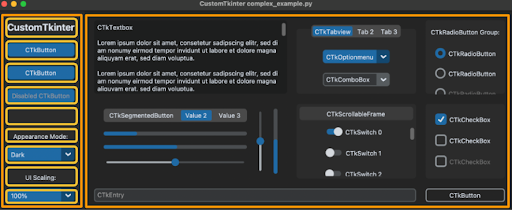
Figure 2: An example program that displays various widgets that CustomTkinter has to offer. The two orange outlined boxes represent two separate columns and within the first orange box/column, multiple yellow outlined boxes are drawn to represent the rows that lie within this column.
In this example, the window represents an entire cell. Within this cell, we can see a row and two columns (the columns are outlined in orange). The first column on the left can be thought of as another cell with multiple rows (outlined in yellow) of its own, where each row has a widget or empty space (for spacing). See if you can figure out the rest of the row/column layout for the second orange column!
Now that we understand the grid, we can begin using the built-in commands to display our widgets. From our starter code, we placed the ‘label’ variable in the first row and column and the ‘button’ variable in the second row and first column using the following:
label.grid(row=0, column=0)
button.grid(row=1, column=0)
Notice how both row and column use zero based indexing. So, the first row/column will always start with zero.
Now let’s say you wanted a row/column to have more space in comparison to the other rows/columns. That’s where ‘grid_columnconfigure’ and ‘grid_rowconfigure’ come in:
self.grid_columnconfigure(column=0, weight=1)
self.grid_rowconfigure(row=0, weight=1)
self.grid_rowconfigure(row=1, weight=1)
With these two commands we can add more ‘weight,’ allowing for three things. A row/column can be wider/narrower than the other rows/columns. We can have an empty row/column that has no widgets (like in Figure 2 where row=4 of column=0 has no widgets). We can also have more space by increasing the weight beyond a value of 1. Try playing around with the weights from the starter code to see how this changes the formatting!
Although difficult to configure at first, with more hands-on experience you will have a better understanding of how the grid works.
Customize Your Widgets
I know we already briefly went over what widgets and tools are, but let’s take a deeper look into some of the most common ones that are used in applications. In this section, we will look at the following widgets and the various ways to customize them: labels, buttons, entries, frames, and scrollable frames.
Labels
Labels are the only way to write text onto your GUI, and they’re very easy to use. With labels, you can specify font, font size, font color, foreground color, and more. View the image below to see various ways to customize your labels.
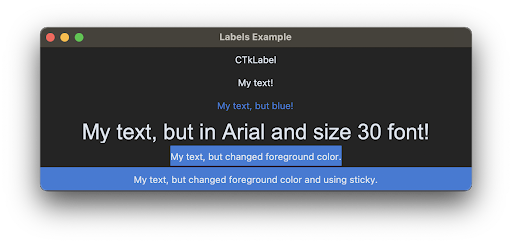
Figure 3: An application window that contains six different examples for customizing labels. Across all six labels, attributes such as text, text color, font, size, foreground color, and sticky were all changed to exemplify various ways to customize labels.
Notice that in the sixth example, the foreground color stretches the entire row while in the fifth example it does not. This is due to the ‘sticky’ attribute when configuring the widget onto your grid.
The ‘sticky’ attribute specifies how the widget should behave when the cell it is placed in is larger than the widget itself. You can set ‘sticky’ equal to any combination of “n”, “s”, “e”, or “w” which each correspond to north, south, east, and west respectively. Doing so tells the widget to anchor itself to that direction of the cell. This is best used when the user wants to resize the window of your application, and you want widgets to remain in certain locations of the window. So in the sixth example, I wanted the label to span across its entire row, so I did ‘sticky=“nsew”’. However, if I wanted it to stick to the top left, I could have done ‘sticky=“nw”’. For a better understanding, try messing around with the code provided in the GitHub repository to see how the ‘sticky’ attribute works!
Buttons
Buttons are probably the most used widget in any application aside from Labels. With CustomTkinter, you can customize your buttons in a variety of ways, including their foreground color, border color, text, image, size, roundness, hover color, and command. Take a look at the image below to see various buttons I created to exemplify some of these attributes.
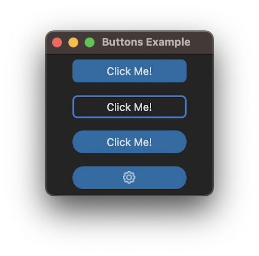
Figure 4: An application window that contains four different examples for customizing buttons. Across all four buttons, attributes such as text, foreground color, border color, border width, corner radius, and image were all changed to exemplify various ways to customize buttons.
Entries
Entry widgets allow for user input. The user input is usually for short responses, such as for looking up a name, entering in a telephone number, providing an email, maybe even a username and password. Just like the widgets before, you can customize your entry widgets as well. You can change the placeholder text, the placeholder text color, the border color, and the entry text color. There are other attributes that can be changed but these are what I found most intriguing. Take a look at the image below to see the various customized widgets that I made along with their code.
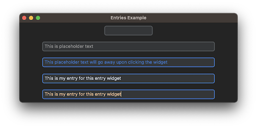
Figure 5: An application window titled “Entries Example” with four different customized entry widgets. Across all four entry widgets, attributes such as width, placeholder text, placeholder text color, border color, and text color were all changed to exemplify various ways to customize entries.
Frames
The Frame widget works as a canvas where more widgets can be placed. They can be customized to change their foreground color along with their border color/width. The only limitation to a frame is how many widgets can be placed. Although you can change the width and height, you cannot go beyond the frame to add more widgets. View the image below to see three different examples of how you can customize your frame.
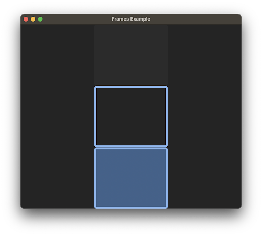
Figure 6: An application window titled “Frames Example” that contains three different types of frames. Across all three frames, attributes such as foreground color, border color, and border width were all changed to exemplify various ways to customize frames.
Just like we used ‘sticky’ for the labels widget so that the foreground would extend to all sides of the row and column of the widget, we can do the same thing for frames! Try adding ‘sticky’ to your frames to see how this looks.
Scrollable Frames
The Scrollable Frame widget also works as a canvas where more widgets can be placed, but this time you can scroll! This also means that there is no limit to how many widgets can be placed, unlike the frame widget. Take a look at the example below.
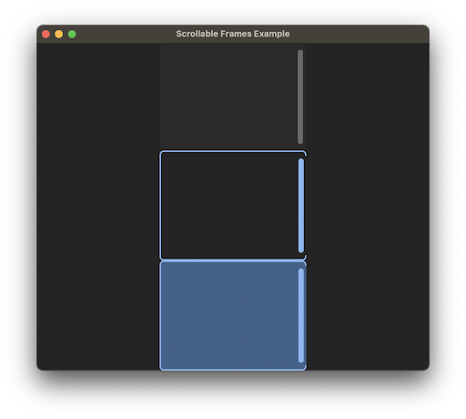
Figure 7: An application window titled “Scrollable Frames Example” that contains three different types of scrollable frames. Across all three frames, attributes such as foreground color, border color, scrollbar button color, and border width were all changed to exemplify various ways to customize scrollable frames.
Making a Complex User Interface
Wow, we covered a lot! Using what we just covered, let’s get into learning how to make a complex interface! Begin by making a new file and copying over the starter code (we will be naming our file complex.py). We then want to make the following change:
self.geometry("1000x500")This changes the window size, so we have more room.
Now, our plan will be to configure the main window like Figure 2, where the main window has one row and two columns. The first column will have a navigation menu and the second column will dynamically change based on the selection made from the navigation menu.
Let’s begin with configuring the window. Your code should be updated to something of this nature:
import customtkinter

customtkinter.set_appearance_mode("System")
customtkinter.set_default_color_theme("blue")

class App(customtkinter.CTk):
    def __init__(self):
        super().__init__()
        self.geometry("1000x500")

        self.grid_rowconfigure(0, weight=1)
        self.grid_columnconfigure(1, weight=1)

app = App()
app.mainloop()
This configuration of the window allows the application to appear in the appearance mode the system is set to (for dark or light), creates a 1000 x 500 pixel window, and configures the first row and second column to have some weight. Notice that we don’t add weight to the first column because the navigation menu will not need that much space. You will be able to see this later, and if you choose to do so, you can always add weight later to see how it affects the layout of the application.
Now, let’s begin by creating a ‘NavigationFrame’ class. In this class, we want there to be a label and two buttons. The label will say “Navigation”, and the two buttons will print a message upon being clicked. Here is the ‘NavigationFrame’ class we’ve created:
class NavigationFrame(customtkinter.CTkFrame):
    def __init__(self, parent, controller):
        super().__init__(parent)
        self.controller = controller
        self.configure(fg_color="grey15")

        title = customtkinter.CTkLabel(self,
                                       text="Navigation",
                                       anchor="center",
                                       font=("Helvetica", 20))
        title.grid(row=0, column=0, padx=(20, 20))

        test1 = customtkinter.CTkButton(self,
                                        text="Frame 1",
                                        anchor="center",
                                        fg_color="transparent",
                                        border_color="#3B8ED0",
                                        border_width=2,
                                        command=self.one_event)
        test1.grid(row=1, column=0, padx=(20, 20), pady=(15,15))

        test2 = customtkinter.CTkButton(self,
                                        text="Frame 2",
                                        anchor="center",
                                        fg_color="transparent",
                                        border_color="#3B8ED0",
                                        border_width=2,
                                        command=self.two_event)
        test2.grid(row=2, column=0, padx=(20, 20), pady=(15,15))

    def one_event(self):
        print(“Frame 1 button clicked”)
    def two_event(self):
        print(“Frame 2 button clicked”)
In this code, we’ve configured each of our widgets to have various customizations. I highly advise reviewing the Customize Your Widgets section or looking into the CustomTkinter widget documentation to see all information regarding widget customization. Once you have, modify the code to change the widget appearance to your liking and play around! Before we move on, notice the ‘self.controller = controller’ line of code. The ‘controller’ variable is a reference to the parent the frame resides in. This will allow for more complexity later, but for now, focus on everything else.
Now that you have copied the code above, add the following at the bottom of your ‘App’ class:
self.navigation = NavigationFrame(self, controller=self)
self.navigation = grid(row=0, column=0, sticky="nesw")
Notice that we passed the reference of the parent class (‘self’) to the NavigationFrame constructor and set ‘controller’ equal to the reference. Setting ‘controller’ equal to the reference will allow us to call functions and manipulate widgets outside the frame you’re currently in.
You should now be able to click either button and it should print a message in your terminal. This was done by assigning a ‘command’ to both buttons. The ‘command’ configuration is what allows there to be functionality for the button. In this case, we assigned the command to be the class’s function ‘one_event’ and ‘two_event.’ Let’s make this even more interesting: how about we change these two functions so that when clicked, it changes the frame in the second column of the main window?
To integrate this feature, we will need to use the variable we created in the NavigationFrame class called ‘self.controller’. Let’s modify our code to the following:
def one_event(self):
	self.controller.frame1.tkraise()
def two_event(self):
	self.controller.frame2.tkraise()
Modifying the code in this way does the following: it uses ‘self.controller’ to call ‘frame1’ (and also ‘frame2’), a frame object (that we will create), from the main window and ‘tkraise(),’ a built in tkinter function, will bring the frame object to the forefront of the window. So, now we need to go back to our ‘App’ class and create these two frame objects.
At the bottom of your ‘App’ class, add the following:
self.frame2 = Frame2(self, controller=self)
self.frame1 = Frame1(self, controller=self)
self.frame1.grid(row=0, column=1, sticky="nsew")
self.frame2.grid(row=0, column=1, sticky="nsew")
Notice the order in which I created these two objects. The order in which they are created determines which will display first, regardless of the order in which the ‘grid()’ function is called. The order is important for all widgets, not just frames, so keep this in mind when creating them! Next, let’s create these two classes: ‘Frame1’ and ‘Frame2’.
Let’s create the ‘Frame1’ class first. This class’s parent will be the ‘CTkFrame’ class and will contain a label with text that says, “Frame 1!” (you can change the text later if you would like). Awesome, see if you can do it on your own first! And when you’re ready, take a look at the code I provided below (or you can copy it right away, up to you!):
class Frame1(customtkinter.CTkFrame):
    def __init__(self, parent, controller):
        super().__init__(parent)

        self.grid_rowconfigure(0, weight=1)
        self.grid_columnconfigure(0, weight=1)

        title = customtkinter.CTkLabel(self,
                                       text="Frame 1!",
                                       anchor="center")
        title.grid(row=0, column=0)
Were you successful in creating the class on your own first? If not, it’s okay! Compare your code to the above, learn what you could do differently, and when you’re ready, let’s move on to creating the ‘Frame2’ class, because this class will be VERY hard in comparison to ‘Frame1’.
So, to create this VERY difficult ‘Frame2’ class, copy the code from ‘Frame1’, change the class name to ‘Frame2’, and change the label’s text to say, “Frame 2!” (just kidding, it wasn’t that hard). We now have two very simple classes that create frame objects where one says, “Frame 1!” and the other says “Frame 2!”. Now, without much more hand holding, because you shouldn’t need too much more at this point, see if you can piece it all together!
Voila! You have now created your first CustomTkinter application! If you weren’t able to piece it all together, don’t worry, we’ve all been there. Go ahead and take a look at the GitHub repository I provided in the beginning of this blog and find the complex.py file. This will have the working code for this application. However, now that I have provided the secret sauce to making a complex application, I ask you only one thing: keep coding! Although the complex application doesn’t do much now other than allow you to switch between two frames, you can continue working off this code to fully develop your application. Add widgets, change the foreground colors of the frames, add more functionality, whatever your heart desires! Good luck!
